We like to shake things up. Change is always a good thing and we were ready. It’s been an exciting few years since launching, we’ve grown and evolved. So, after a chat down at our local about what the future holds, a rebrand was the first on our list.
We caught up with our Founder, Toby and Kate, our Head of Marketing to get the down-low on how our rebrand came to life. Here’s everything you need to know!
As a relatively new brand in the industry, why then do you feel like now was right time to rebrand?
Kate:
Two began quite organically and the team has grown quickly and are always moving at a rapid pace. Like many startups, Two has been focused on building rapport with their clients and delivering top quality work but it was time to step back and take stock and make sure that the brand reflected the team and vice versa.
Toby:
We launched Two with a clear idea of how it would have a very different approach to the design and delivery of workplaces. We were so excited about the new company, and the team we’d assembled for it, that we wanted to start quickly. And it’s done incredibly well in the first year! The one thing that didn’t quite work for me was the initial branding, but I’ve learnt over the years that these things can take a while to develop; so we’ve been working in the background on the real Two. Now we’re ready to go.
Talk us through what the Two brand signifies to you, and more importantly, what the rebrand signifies?
Kate:
Two is all about the relationship, at the very heart of the process is ensuring the trust between both sides is developed and nurtured, so that they work together to achieve fantastic results. The rebrand was a chance to bring those core values to life. The bright and vibrant coral is bold and energetic, just like the team. The quirky typography reflects the exciting and different approach that the Two team take. There is certainly nothing standard about this team! The plus device and the pairings of words are a reflection of the behaviour of the team, and how they interact. We appreciate that sometimes ideas are complementary and sometimes they are contrasting but that doesn’t make either right or wrong, the key is the spark that is ignited when the two ideas come together.
Toby:
The Two brand stands for the things we consider central to the business proposition: creativity, absurdly high levels of customer service, and fun! The rebrand has resulted in a tweak to the logo, a new suite of colours, and a really clever word pairing device to create phrases that say something about who we are and what we do: some serious, some playful.
The name Two has a strong meaning, what is that meaning?
Kate:
Two is all about collaboration. It’s two people coming together, sharing ideas, bouncing ideas back and forth and developing the best possible solution. Two as a name, made sense because the team are constantly working together alongside clients. The relationship is intimate, like friends working towards a common goal.
Toby:
Two is all about the relationship between us and our clients. Our customers tend to be owner-managed businesses that have a very clear idea of their brands and understand the power of place in conveying their values. They’re spending their own money, so they’re careful, but they’re also ambitious and want to be deeply involved. Two’s processes are all about this, and the team totally gets it. We coined the phrase: “together we are Two”; it means us and our client working together as a team to create incredible results.
‘We launched Two with a clear idea of how it would have a very different approach to the design and delivery of workplaces. We were so excited about the new company, and the team we’d assembled for it, that we wanted to start quickly.’
What are the most exciting and engaging parts of this rebrand?
Kate:
There are three key elements to the brand, the typography, the pairings and the colour. Each of them works together to create the dynamic, bold, energetic and exciting brand look and feel. I love the typography the best though, because it’s not that common to have a font that fits so perfectly with the brand essence. The quirky movements of the letters make it a fun and interesting, different. All things that represent Two.
Toby:
I’ve already mentioned the word pairing device. It works in many ways: obviously there are two words in each case so that’s echoing the company name. But we use the words as a brand extension: to decide on project themes, to suggest values and make puns to bring a smile. It’s a brilliant idea and appears on the new website, brochures, umbrellas, pens, mugs…even the Correx on site.
One of the key differences of the rebrand is the colour ways, how and why did you come to the decision to change this?
Kate:
The Two team are unique and so we needed a colour that stood out! This particular shade was selected because it is strong and bold, yet playful. The brightness of the colour also feels energetic and fresh.
Toby:
I can’t even remember where the original yellow and blue branding came from. It’s nice, but not bold enough for us. The new coral base colour is vibrant and strong. It makes a dramatic statement when used online and in print. We really like it.
As a typographic brand, with partnerships at the heart of what you do, your brand pairings are hugely important. Talk us through how you came to discover those pairings?
Kate:
The pairings felt like a natural communication tool. It aligned perfectly with the mindset and behaviour of the Two team, who truly believe in the power of two people coming together. What is great about the pairings is that it brings together things that complement as well as contrast, they can be serious or playful, cheeky or informative.
Toby:
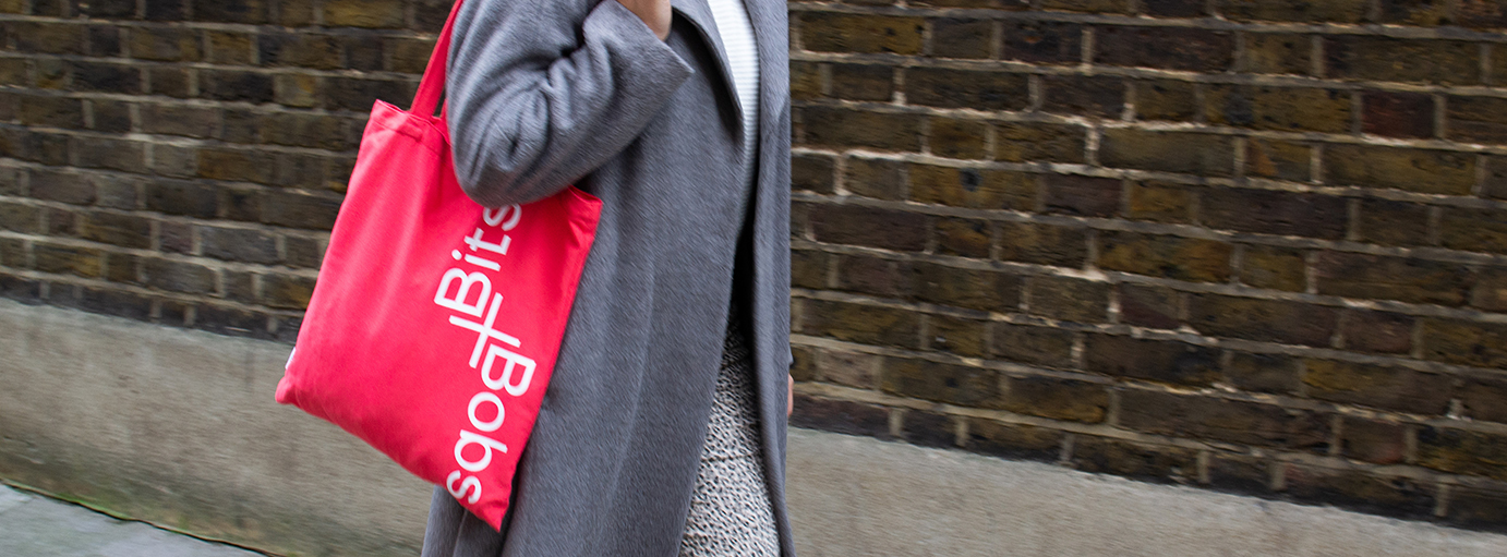
The pairing device is so powerful. I guess it started with the phrase “you + me” as a basis for the Two concept. Once we invented it, the ideas for how to use it came thick + fast! The rule is that the word pairs have to be a recognisable phrase, or alliterative. There are some great examples we’re already using: like our tote bags branded “bits + bobs” or the meeting room called “back + forth”!